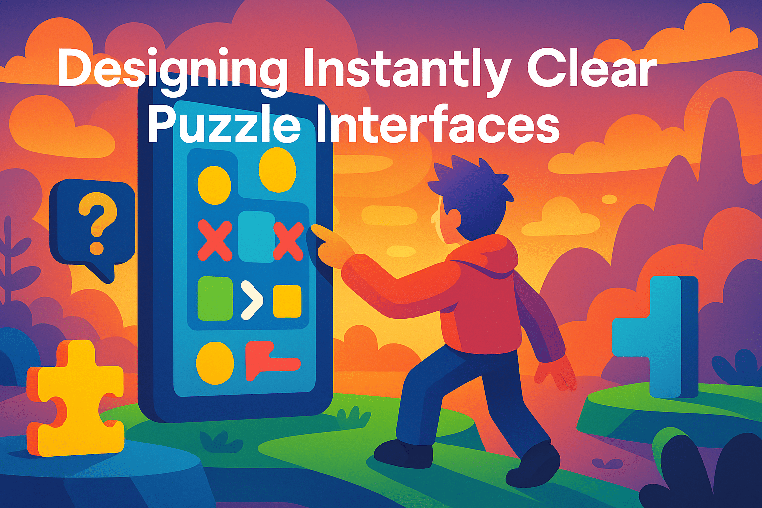
How to Design Puzzle Interfaces That Feel Instantly Understandable
One of the biggest challenges in puzzle game development is building an interface that players understand within seconds. A clear, intuitive interface removes friction, helps players focus on problem-solving, and dramatically increases early retention. In this article, I’ll share my step-by-step approach to designing puzzle interfaces that communicate rules naturally, without long tutorials or cluttered layouts. The goal is to create UI that guides players through logic, not instructions.
The Importance of Instant Clarity
Puzzle games rely on cognitive flow. If the interface is confusing, players break out of that flow and feel lost, even before interacting with the first level. A good puzzle UI needs to feel like part of the puzzle itself—simple, readable, and responsive.
What makes a puzzle interface “instantly understandable”?
- Consistency: similar elements behave the same way every time.
- Predictable visual language: shapes, colors, and icons reinforce rules.
- Minimalism: no distractions, only meaningful visual information.
- Direct feedback: every action produces a clear reaction.
These principles form the foundation of intuitive puzzle UI design.
Step 1: Define the Core Interaction
The interface should highlight the single most important action in the puzzle. Everything else is secondary. Before designing any UI, I identify the core action the player performs most frequently—swapping tiles, rotating pieces, dragging paths, or tapping elements.
Helpful questions
- What is the player touching 80% of the time?
- Should the interface emphasize movement, selection, or creation?
- Is the mechanic spatial, logical, or pattern-based?
The UI should make this main action visually obvious and physically easy to perform.
Step 2: Use Clear Shapes and Visual Hierarchy
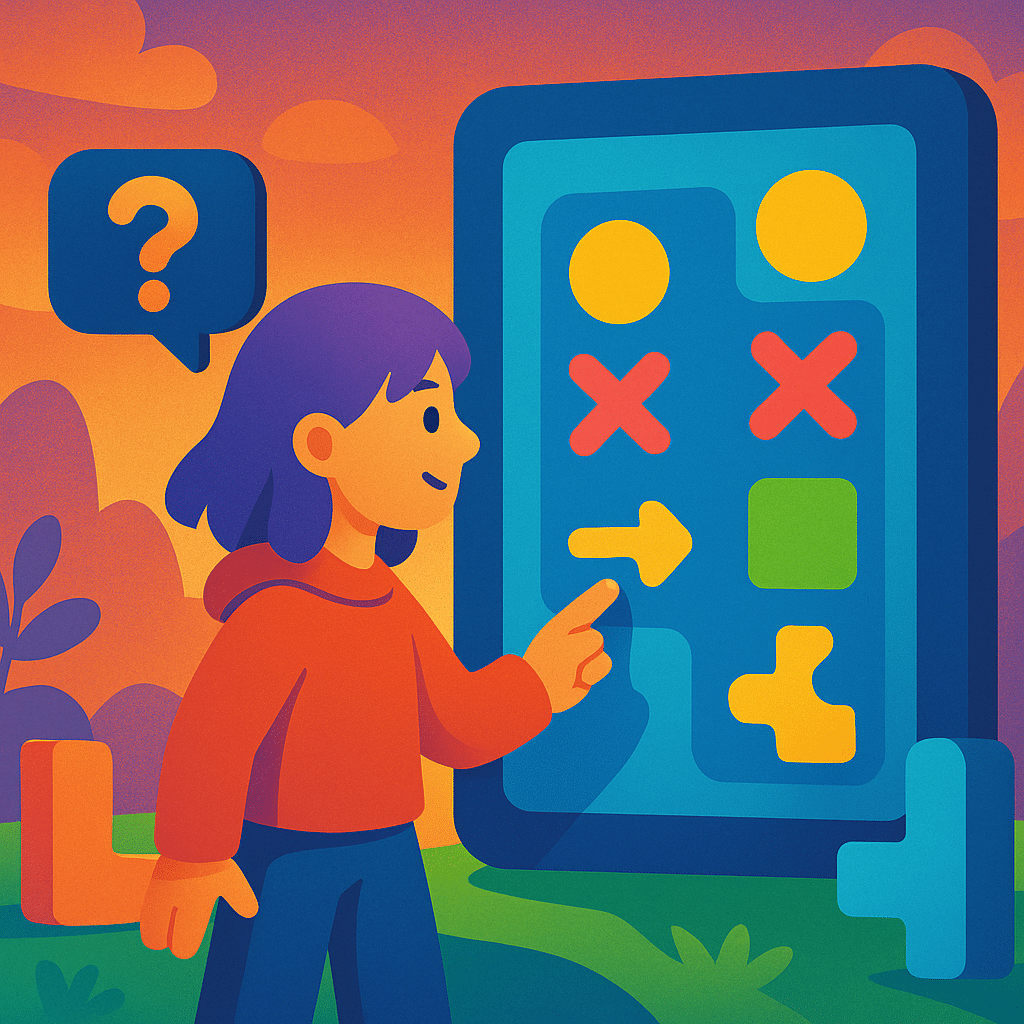
Players instinctively understand shapes. Squares feel stable; circles feel active; arrows suggest direction. A puzzle interface that uses a strong visual hierarchy helps guide attention without verbal explanation.
Common visual hierarchy techniques
- Size: larger elements attract more attention.
- Color contrast: bright or saturated colors signal interactivity.
- Grouping: related elements should be visually close together.
- Whitespace: spacing reduces cognitive load and improves legibility.
Example interface hierarchy
| Element Type | Visual Priority | Reason |
|---|---|---|
| Player action zone | Highest | The player interacts here constantly |
| Goals or objectives | Medium | Important but not touched directly |
| Secondary buttons | Low | Should not distract from gameplay |
This prioritization ensures players always know where to look first.
Step 3: Establish a Strong Color Language
Color communicates meaning faster than text. A well-chosen palette can teach rules naturally by showing relationships between puzzle pieces.
What to consider when choosing colors
- Use one color per mechanic or tile type.
- Avoid using too many high-saturation colors at once.
- Ensure interactive elements stand out against the background.
- Use warm colors for urgent actions and cool colors for passive states.
A consistent color system allows players to predict outcomes without guessing.
Step 4: Provide Immediate and Satisfying Feedback
Feedback transforms interaction into understanding. When players tap, drag, or rotate something, the response should be instant and meaningful.
Feedback types that work well in puzzle games
- Visual feedback: highlights, glows, shake animations, color shifts.
- Audio feedback: clicks, pops, and chimes tied to puzzle logic.
- Haptic feedback: subtle vibrations when using touch devices.
“Feedback is communication. A puzzle that responds elegantly teaches players the rules without saying a word.”
The goal is to build confidence. A puzzle that feels responsive becomes instantly more enjoyable.
Step 5: Remove Anything That Creates Confusion
Clarity often comes from subtraction. If an element doesn’t support gameplay or guide the player, it should be simplified or removed entirely.
Common sources of UI confusion
- Icons that look similar but mean different things
- Overdecorated backgrounds or busy animations
- Buttons placed too close to the play area
- Unclear indicators for locked or inactive elements
Less clutter makes the core puzzle logic stand out naturally.
Step 6: Test With New Players and Observe Quietly
The ultimate measure of interface clarity is whether someone can pick up the game and understand it without talking to you. During playtests, I avoid explaining anything and watch where players get stuck.
Signals that your UI works
- The player immediately interacts with the correct element.
- They learn rules through feedback, not instructions.
- They rarely pause to think about what to press next.
- They describe the interface as “smooth” or “obvious.”
These are strong signs that your puzzle interface communicates effectively on its own.
Final Thoughts
Designing puzzle interfaces that feel instantly understandable requires careful attention to interaction, visual hierarchy, color, feedback, and player psychology. A well-designed interface doesn’t just support the puzzle—it becomes part of the puzzle’s identity and flow. By focusing on clarity and player intuition, you can create puzzle experiences that feel accessible, rewarding, and deeply engaging from the very first tap.
Post Comment